Tuesday, April 10, 2018

Help Needed- Sunday Teams

The Sunday Teams are in desperate need!

-Do you enjoy driving a box truck?

-Do you take delight in arranging napkins, sugars, creamers, cups, and organizing things?

-Do you like picking things up and putting them down?

-Do you enjoy getting up early on Sunday mornings?

-Are you technically savvy?

-Do you enjoy A/V?

-Do you enjoy brewing drip coffee?


If you or a friend answered YES to ANY of those questions… Please consider joining the Trucking Team, Cafe Team, or Presentation Team.

Contact: Christy Sonnenberg

How the Mobile-First Index Disrupts the Link Graph

Posted by rjonesx.

It's happened to all of us. You bring up a webpage on your mobile device, only to find out that a feature you were accustomed to using on desktop simply isn't available on mobile. While frustrating, it has always been a struggle for web developers and designers alike to simplify and condense their site on mobile screens without needing to strip features or content that would otherwise clutter a smaller viewport. The worst-case scenario for these trade-offs is that some features would be reserved for desktop environments, or perhaps a user might be able to opt out of the mobile view. Below is an example of how my personal blog displays the mobile version using a popular plugin by ElegantThemes called HandHeld. As you can see, the vast page is heavily stripped down and is far easier to read... but at what cost? And at what cost to the link graph?

My personal blog drops 75 of the 87 links, and all of the external links, when the mobile version is accessed. So what happens when the mobile versions of sites become the primary way the web is accessed, at scale, by the bots which power major search engines?

Google's announcement to proceed with a mobile-first index raises new questions about how the link structure of the web as a whole might be influenced once these truncated web experiences become the first (and sometimes only) version of the web Googlebot encounters.

So, what's the big deal?

The concern, which no doubt Google engineers have studied internally, is that mobile websites often remove content and links in order to improve user experience on a smaller screen. This abbreviated content fundamentally alters the link structure which underlies one of the most important factors in Google's rankings. Our goal is to try and understand the impact this might have.

Before we get started, one giant unknown variable which I want to be quick to point out is we don't know what percentage of the web Google will crawl with both its desktop and mobile bots. Perhaps Google will choose to be "mobile-first" only on sites that have historically displayed an identical codebase to both the mobile and desktop versions of Googlebot. However, for the purposes of this study, I want to show the worst-case scenario, as if Google chose not only to go "mobile-first," but in fact to go "mobile-only."

Methodology: Comparing mobile to desktop at scale

For this brief research, I decided to grab 20,000 random websites from the Quantcast Top Million. I would then crawl two levels deep, spoofing both the Google mobile and Google desktop versions of Googlebot. With this data, we can begin to compare how different the link structure of the web might look.

Homepage metrics

Let's start with some descriptive statistics of the home pages of these 20,000 randomly selected sites. Of the sites analyzed, 87.42% had the same number of links on their homepage regardless of whether the bot was mobile- or desktop-oriented. Of the remaining 12.58%, 9% had fewer links and 3.58% had more. This doesn't seem too disparate at first glance.

Perhaps more importantly, only 79.87% had identical links on the homepage when visited by desktop and mobile bots. Just because the same number of links were found didn't mean they were actually the same links. This is important to take into consideration because links are the pathways which bots use to find content on the web. Different paths mean a different index.

Among the homepage links, we found a 7.4% drop in external links. This could mean a radical shift in some of the most important links on the web, given that homepage links often carry a great deal of link equity. Interestingly, the biggest "losers" as a percentage tended to be social sites. In retrospect, it seems reasonable that one of the common types of links a website might remove from their mobile version would be social share buttons because they're often incorporated into the "chrome" of a page rather than the content, and the "chrome" often changes to accommodate a mobile version.

The biggest losers as a percentage in order were:

  1. linkedin.com
  2. instagram.com
  3. twitter.com
  4. facebook.com

So what's the big deal about 5–15% differences in links when crawling the web? Well, it turns out that these numbers tend to be biased towards sites with lots of links that don't have a mobile version. However, most of those links are main navigation links. When you crawl deeper, you just find the same links. But those that do deviate end up having radically different second-level crawl links.

Second-level metrics

Now this is where the data gets interesting. As we continue to crawl out on the web using crawl sets that are influenced by the links discovered by a mobile bot versus a desktop bot, we'll continue to get more and more divergent results. But how far will they diverge? Let's start with size. While we crawled an identical number of home pages, the second-tier results diverged based on the number of links found on those original home pages. Thus, the mobile crawlset was 977,840 unique URLs, while the desktop crawlset was 1,053,785. Already we can see a different index taking shape — the desktop index would be much larger. Let's dig deeper.

I want you to take a moment and really focus on this graph. Notice there are three categories:

  • Mobile Unique: Blue bars represent unique items found by the mobile bot
  • Desktop Unique: Orange bars represent unique items found by the desktop bot
  • Shared: Gray bars represent items found by both

Notice also that there are there are four tests:

  • Number of URLs discovered
  • Number of Domains discovered
  • Number of Links discovered
  • Number of Root Linking Domains discovered

Now here is the key point, and it's really big. There are more URLs, Domains, Links, and Root Linking Domains unique to the desktop crawl result than there are shared between the desktop and mobile crawler. The orange bar is always taller than the gray. This means that by just the second level of the crawl, the majority of link relationships, pages, and domains are different in the indexes. This is huge. This is a fundamental shift in the link graph as we have come to know it.

And now for the big question, what we all care about the most — external links.

A whopping 63% of external links are unique to the desktop crawler. In a mobile-only crawling world, the total number of external links was halved.

What is happening at the micro level?

So, what's really causing this huge disparity in the crawl? Well, we know it has something to do with a few common shortcuts to making a site "mobile-friendly," which include:

  1. Subdomain versions of the content that have fewer links or features
  2. The removal of links and features by user-agent detecting plugins

Of course, these changes might make the experience better for your users, but it does create a different experience for bots. Let's take a closer look at one site to see how this plays out.

This site has ~10,000 pages according to Google and has a Domain Authority of 72 and 22,670 referring domains according to the new Moz Link Explorer. However, the site uses a popular WordPress plugin that abbreviates the content down to just the articles and pages on the site, removing links from descriptions in the articles on the category pages and removing most if not all extraneous links from the sidebar and footer. This particular plugin is used on over 200,000 websites. So, what happens when we fire up a six-level-deep crawl with Screaming Frog? (It's great for this kind of analysis because we can easily change the user-agent and restrict settings to just crawl HTML content.)

The difference is shocking. First, notice that in the mobile crawl on the left, there is clearly a low number of links per page and that number of links is very steady as you crawl deeper through the site. This is what produces such a steady, exponential growth curve. Second, notice that the crawl abruptly ended at level four. The site just didn't have any more pages to offer the mobile crawler! Only ~3,000 of the ~10,000 pages Google reports were found.

Now, compare this to the desktop crawler. It explodes in pages at level two, collecting nearly double the total pages of the mobile crawl at this level alone. Now, recall the graph before showing that there were more unique desktop pages than there were shared pages when we crawled 20,000 sites. Here is confirmation of exactly how it happens. Ultimately, 6x the content was made available to the desktop crawler in the same level of crawl depth.

But what impact did this have on external links?

Wow. 75% of the external, outbound links were culled in the mobile version. 4,905 external links were found in the desktop version while only 1,162 were found in the mobile. Remember, this is a DA 72 site with over twenty thousand referring domains. Imagine losing that link because the mobile index no longer finds the backlink. What should we do? Is the sky falling?

Take a deep breath

Mobile-first isn't mobile-only

The first important caveat to all this research is that Google isn't giving up on the desktop — they're simply prioritizing the mobile crawl. This makes sense, as the majority of search traffic is now mobile. If Google wants to make sure quality mobile content is served, they need to shift their crawl priorities. But they also have a competing desire to find content, and doing so requires using a desktop crawler so long as webmasters continue to abbreviate the mobile versions of their sites.

This reality isn't lost on Google. In the Original Official Google Mobile First Announcement, they write...

If you are building a mobile version of your site, keep in mind that a functional desktop-oriented site can be better than a broken or incomplete mobile version of the site.

Google took the time to state that a desktop version can be better than an "incomplete mobile version." I don't intend to read too much into this statement other than to say that Google wants a full mobile version, not just a postcard.

Good link placements will prevail

One anecdotal outcome of my research was that the external links which tended to survive the cull of a mobile version were often placed directly in the content. External links in sidebars like blog-rolls were essentially annihilated from the index, but in-content links survived. This may be a signal Google picks up on. External links that are both in mobile and desktop tend to be the kinds of links people might click on.

So, while there may be fewer links powering the link graph (or at least there might be a subset that is specially identified), if your links are good, content-based links, then you have a chance to see improved performance.

I was able to confirm this by looking at a subset of known good links. Using Fresh Web Explorer, I looked up fresh links to toysrus.com which is currently gaining a great deal of attention due to stores closing. We can feel confident that most of these links will be in-content because the articles themselves are about the relevant, breaking news regarding Toys R Us. Sure enough, after testing 300+ mentions, we found the links to be identical in the mobile and desktop crawls. These were good, in-content links and, subsequently, they showed up in both versions of the crawl.

Selection bias and convergence

It is probably the case that popular sites are more likely to have a mobile version than non-popular sites. Now, they might be responsive — at which point they would yield no real differences in the crawl — but at least some percentage would likely be m.* domains or utilize plugins like those mentioned above which truncate the content. At the lower rungs of the web, older, less professional content is likely to have only one version which is shown to mobile and desktop devices alike. If this is the case, we can expect that over time the differences in the index might begin to converge rather than diverge, as my study looked only at sites that were in the top million and only crawled two levels deep.

Moreover (this one is a bit speculative), but I think over time that there will be convergence between a mobile and desktop index. I don't think the link graphs will grow exponentially different as the linked web is only so big. Rather, the paths to which certain pages are reached, and the frequency with which they are reached, will change quite a bit. So, while the link graph will differ, the set of URLs making up the link graph will largely be the same. Of course, some percentage of the mobile web will remain wholly disparate. The large number of sites that use dedicated mobile subdomains or plugins that remove substantial sections of content will remain like mobile islands in the linked web.

Impact on SERPs

It's difficult at this point to say what the impact on search results will be. It will certainly not leave the SERPs unchanged. What would be the point of Google making and announcing a change to its indexing methods if it didn't improve the SERPs?

That being said, this study wouldn't be complete without some form of impact assessment. Hat tip to JR Oakes for giving me this critique, otherwise I would have forgotten to take a look.

First, there are a couple of things which could mitigate dramatic shifts in the SERPs already, regardless of the veracity of this study:

  • A slow rollout means that shifts in SERPs will be lost to the natural ranking fluctuations we already see.
  • Google can seed URLs found by mobile or by desktop into their respective crawlers, thereby limiting index divergence. (This is a big one!)
  • Google could choose to consider, for link purposes, the aggregate of both mobile and desktop crawls, not counting one to the exclusion of the other.

Second, the relationships between domains may be less affected than other index metrics. What is the likelihood that the relationship between Domain X and Domain Y (more or less links) is the same for both the mobile- and desktop-based indexes? If the relationships tend to remain the same, then the impact on SERPs will be limited. We will call this relationship being "directionally consistent."

To accomplish this part of the study, I took a sample of domain pairs from the mobile index and compared their relationship (more or less links) to their performance in the desktop index. Did the first have more links than the second in both the mobile and desktop? Or did they perform differently?

It turns out that the indexes were fairly close in terms of directional consistency. That is to say that while the link graphs as a whole were quite different, when you compared one domain to another at random, they tended in both data sets to be directionally consistent. Approximately 88% of the domains compared maintained directional consistency via the indexes. This test was only run comparing the mobile index domains to the desktop index domains. Future research might explore the reverse relationship.

So what's next?: Moz and the mobile-first index

Our goal for the Moz link index has always been to be as much like Google as possible. It is with that in mind that our team is experimenting with a mobile-first index as well. Our new link index and Link Explorer in Beta seeks to be more than simply one of the largest link indexes on the web, but the most relevant and useful, and we believe part of that means shaping our index with methods similar to Google. We will keep you updated!


Sign up for The Moz Top 10, a semimonthly mailer updating you on the top ten hottest pieces of SEO news, tips, and rad links uncovered by the Moz team. Think of it as your exclusive digest of stuff you don't have time to hunt down but want to read!

Monday, April 9, 2018

Google Confirms Chrome Usage Data Used to Measure Site Speed

Posted by Tom-Anthony

During a discussion with Google’s John Mueller at SMX Munich in March, he told me an interesting bit of data about how Google evaluates site speed nowadays. It has gotten a bit of interest from people when I mentioned it at SearchLove San Diego the week after, so I followed up with John to clarify my understanding.

The short version is that Google is now using performance data aggregated from Chrome users who have opted in as a datapoint in the evaluation of site speed (and as a signal with regards to rankings). This is a positive move (IMHO) as it means we don’t need to treat optimizing site speed for Google as a separate task from optimizing for users.

Previously, it has not been clear how Google evaluates site speed, and it was generally believed to be measured by Googlebot during its visits — a belief enhanced by the presence of speed charts in Search Console. However, the onset of JavaScript-enabled crawling made it less clear what Google is doing — they obviously want the most realistic data possible, but it's a hard problem to solve. Googlebot is not built to replicate how actual visitors experience a site, and so as the task of crawling became more complex, it makes sense that Googlebot may not be the best mechanism for this (if it ever was the mechanism).

In this post, I want to recap the pertinent data around this news quickly and try to understand what this may mean for users.

Google Search Console

Firstly, we should clarify our understand of what the "time spent downloading a page" metric in Google Search Console is telling us. Most of us will recognize graphs like this one:

Until recently, I was unclear about exactly what this graph was telling me. But handily, John Mueller comes to the rescue again with a detailed answer [login required] (hat tip to James Baddiley from Chillisauce.com for bringing this to my attention):

John clarified what this graph is showing:

It's technically not "downloading the page" but rather "receiving data in response to requesting a URL" - it's not based on rendering the page, it includes all requests made.

And that it is:

this is the average over all requests for that day

Because Google may be fetching a very different set of resources every day when it's crawling your site, and because this graph does not account for anything to do with page rendering, it is not useful as a measure of the real performance of your site.

For that reason, John points out that:

Focusing blindly on that number doesn't make sense.

With which I quite agree. The graph can be useful for identifying certain classes of backend issues, but there are also probably better ways for you to do that (e.g. WebPageTest.org, of which I’m a big fan).

Okay, so now we understand that graph and what it represents, let’s look at the next option: the Google WRS.

Googlebot & the Web Rendering Service

Google’s WRS is their headless browser mechanism based on Chrome 41, which is used for things like "Fetch as Googlebot" in Search Console, and is increasingly what Googlebot is using when it crawls pages.

However, we know that this isn’t how Google evaluates pages because of a Twitter conversation between Aymen Loukil and Google’s Gary Illyes. Aymen wrote up a blog post detailing it at the time, but the important takeaway was that Gary confirmed that WRS is not responsible for evaluating site speed:

Twitter conversation with Gary Ilyes

At the time, Gary was unable to clarify what was being used to evaluate site performance (perhaps because the Chrome User Experience Report hadn’t been announced yet). It seems as though things have progressed since then, however. Google is now able to tell us a little more, which takes us on to the Chrome User Experience Report.

Chrome User Experience Report

Introduced in October last year, the Chrome User Experience Report “is a public dataset of key user experience metrics for top origins on the web,” whereby “performance data included in the report is from real-world conditions, aggregated from Chrome users who have opted-in to syncing their browsing history and have usage statistic reporting enabled.”

Essentially, certain Chrome users allow their browser to report back load time metrics to Google. The report currently has a public dataset for the top 1 million+ origins, though I imagine they have data for many more domains than are included in the public data set.

In March I was at SMX Munich (amazing conference!), where along with a small group of SEOs I had a chat with John Mueller. I asked John about how Google evaluates site speed, given that Gary had clarified it was not the WRS. John was kind enough to shed some light on the situation, but at that point, nothing was published anywhere.

However, since then, John has confirmed this information in a Google Webmaster Central Hangout [15m30s, in German], where he explains they're using this data along with some other data sources (he doesn’t say which, though notes that it is in part because the data set does not cover all domains).

At SMX John also pointed out how Google’s PageSpeed Insights tool now includes data from the Chrome User Experience Report:

The public dataset of performance data for the top million domains is also available in a public BigQuery project, if you're into that sort of thing!

We can’t be sure what all the other factors Google is using are, but we now know they are certainly using this data. As I mentioned above, I also imagine they are using data on more sites than are perhaps provided in the public dataset, but this is not confirmed.

Pay attention to users

Importantly, this means that there are changes you can make to your site that Googlebot is not capable of detecting, which are still detected by Google and used as a ranking signal. For example, we know that Googlebot does not support HTTP/2 crawling, but now we know that Google will be able to detect the speed improvements you would get from deploying HTTP/2 for your users.

The same is true if you were to use service workers for advanced caching behaviors — Googlebot wouldn’t be aware, but users would. There are certainly other such examples.

Essentially, this means that there's no longer a reason to worry about pagespeed for Googlebot, and you should instead just focus on improving things for your users. You still need to pay attention to Googlebot for crawling purposes, which is a separate task.

If you are unsure where to look for site speed advice, then you should look at:

That’s all for now! If you have questions, please comment here and I’ll do my best! Thanks!


Sign up for The Moz Top 10, a semimonthly mailer updating you on the top ten hottest pieces of SEO news, tips, and rad links uncovered by the Moz team. Think of it as your exclusive digest of stuff you don't have time to hunt down but want to read!

Friday, April 6, 2018

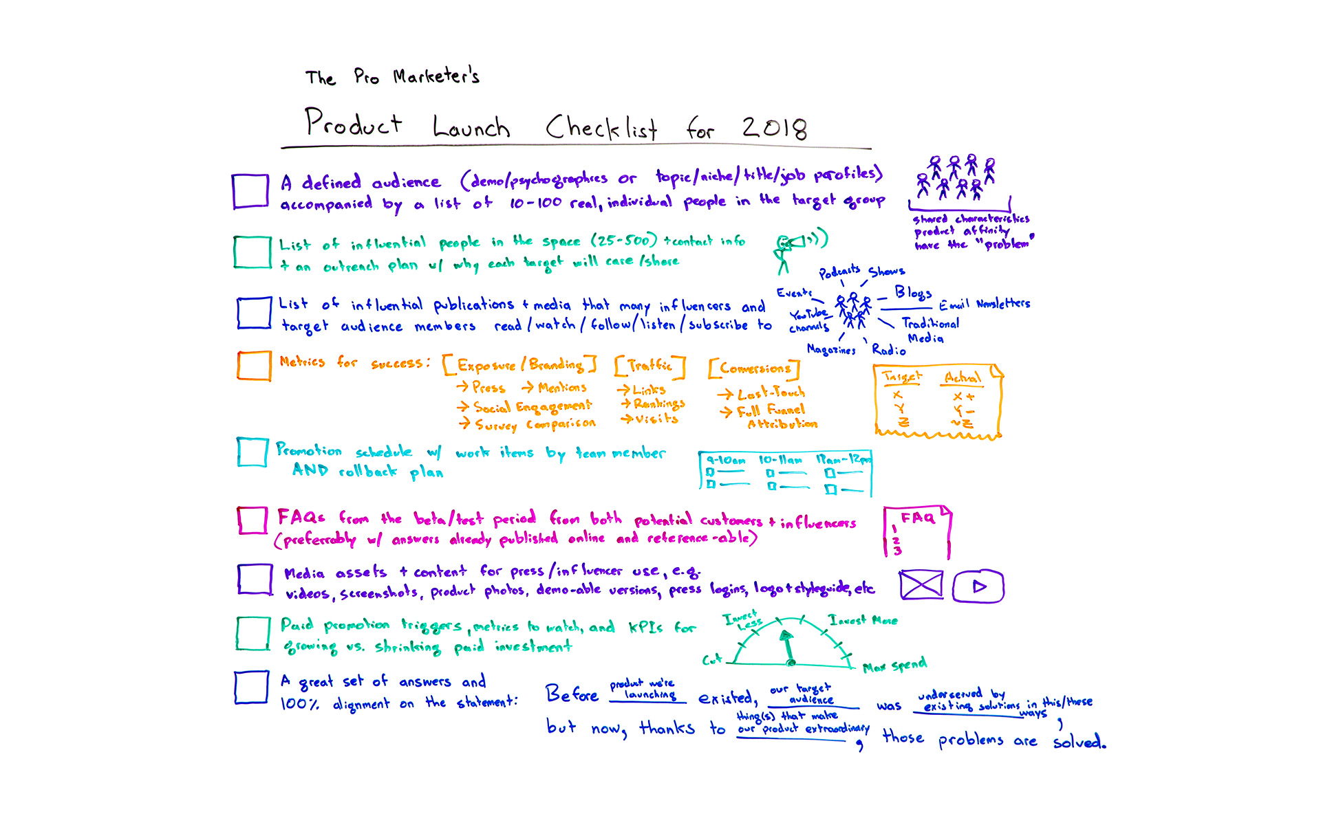
The Pro Marketer's Product Launch Checklist for 2018 - Whiteboard Friday

Posted by randfish

What goes into a truly exceptional product launch? To give your new product a feature the best chance at success, it's important to wrangle all the many moving pieces involved in pulling off a seamless marketing launch. From listing audience members and influencers to having the right success metrics to having a rollback plan, Rand shares his best advice in the form of an actionable checklist in this Whiteboard Friday. And make sure to check out the last item — it may be the best one to start with!

The Pro Marketer's Product Launch Checklist 2018

Click on the whiteboard image above to open a high-resolution version in a new tab!

Video Transcription

Howdy, Moz fans, and welcome to another edition of Whiteboard Friday. This week we are chatting about crafting a professional marketer's product launch checklist for 2018.

So many of you are undoubtedly in the business of doing things around SEO and around web marketing, around content marketing, around social media marketing in service of a product that you are launching or a feature that you are launching or multiple products. I think it pays for us to examine what goes into a very successful product launch.

Of course, I've been a part of many of these at Moz, as part of many of the startups and other companies that I advise, and there are some shared characteristics, particularly from the marketing perspective. I won't focus on the product and engineering perspectives. We'll talk about marketing product launches today.

☑ A defined audience, accompanied by a list of 10–100 real, individual people in the target group

So to start with, very first, top of our list, a defined audience. That can be a demographic or a psychographic set of characteristics that define your audience or a topic, a niche, a job title or job function type of characteristics that comprise the profile of who's in your group. That should be accompanied by a list of 10 to 100 real people.

I know that many marketers out there love using personas, and I think it's fine to use personas to help define this audience. But I'm going to urge you strongly to have that real list. Those could be:

  • Customers that you know you're targeting,
  • People who have bought from you in the past and you're hoping will buy again,
  • People who maybe you've lost and are hoping to recapture, maybe they use a competitor's product today or they're notable in some way.

As long as they fit your characteristics, I want you to have that list of those real people.

The problem with personas is you can't talk to them. You can't ask them real questions, or you can, but only in your own mind and your imagination fills in the details. These are real people that you can talk to, email, ask questions, show the product to, show the launch plan to and get real feedback. They should have shared characteristics. They should have an affinity for the product that you're building or launching, hopefully, and they should share the problem.

Whatever the problem, almost every product, in fact, hopefully every product is actually trying to solve a problem better than the thing that came before it or the many things that came before it. Your audience should share whatever that problem is that you're trying to solve.

☑ List of 25–500 influential people in the space, + contact info and an outreach plan

Okay. We'll give this a nice check mark. Next, list of influential people in the space. That could be 25 to even hundreds or thousands of people potentially, plus their contact information and an outreach plan. That outreach plan should include why each target is going to care about the problem, about the solution, and why they're going to share. Why will they amplify?

This is in answer to the question: Who will help amplify this and why? If you don't have a great answer to that, your product launch will almost certainly fall flat from a marketing perspective. If you can build a successful one of these, that list, especially if before you even launch, you know that 20 of these 500 people have said, "Yes, I'm going to amplify. Here's why I care about this. I can't wait until you give me permission to share it or release this thing or send me the version of it." That's an awesome, awesome step.

☑ List of influential publications and media that influencers and target audience members consume

Next, similarly, just like we have a list of influential people, we want a list of influential publications and media that many influencers and many of your target audience members read, watch, subscribe to, listen to, follow, etc. So it's basically these two groups should be paying attention to the media, to the publications that we're trying to list out here. Essentially, that could be events that these people go to. It could be podcasts they listen to. It could be shows they watch, blogs or email newsletters they subscribe to. It could be traditional media, magazines, radio, YouTube channel. Whatever those publications are, all of them are the ones we're trying to build a list of here.

That is going to be part of our outreach target. We might have these influential people, and some of these could overlap. Some of these influential people may work for or at these influential publications and that's fine. I just worry that too much influencer marketing is focused on individuals and not on publications when, in fact, both are critical to a product launch success.

☑ Metrics for success

Metrics, yes, marketers need metrics for success. Those should be in three buckets — exposure and branding, which include things like press and mentions and social engagement, maybe a survey comparison of before and after. We ran an anonymous survey to a group of our target audience before and after and we measured brand awareness differential. Traffic, so links, rankings, visits, time on site, etc., and conversions. That could be measured through last touch or through preferably full-funnel attribution.

☑ Promotional schedule with work items by team member and rollback plan

A promotion schedule. So this means we actually know what we're doing and in what order as the launch rolls out. That could be before launch we're doing a bunch of things around private beta or around sharing with some of these influential people and publications. Or we haven't defined the audience yet. We need to do that. We have that schedule and work items by each team member, and we're going to need a rollback plan. So if at any point along the way, the person who owns the product process says, "This is not good enough," or, "We have a fundamental error," or, "The flamethrower we're building shoots ice instead of fire," we should probably either rename and rebrand it or roll it back. We have that structure set up.

☑ FAQ from the beta/test period, from both potential customers and influencers

Next, frequently asked questions. This is where a beta or test period and test users come in super handy, because they will have asked us a bunch of questions. They'll have asked as they're playing with or observing or using the product. We should be able to take all of those questions from both potential customers and from influencers, and we should have those answers set up for our customer service and help teams and for people who are interfacing with the press and with influencers in case they reach out.

In an ideal world, we would also publish these online. We would have a place where we could reference them. They're already published. This is particularly handy when press and influencers cover a launch and they link to a, "Oh, here's how the ice thrower," I'm assuming, "that we're building is meant to work, and here's at what temperatures it's safe to operate," etc.

☑ Media assets & content for press/influencer use

Next up, media assets and content for those press and publications and influencer use. For example:

  • Videos of people using the product and playing with it
  • Screencasts, screenshots if it's a digital or software product
  • Photos
  • Demo-able versions if you want to give people login access to something special
  • Guidelines for press usage and citations, as well as things like logo and style guide

All of those types of things. Trust me, if your product launch goes well, people will ask you for this, or they will just use things that they steal from your site. You would much prefer to be able to control these assets and to control where the links and citations point, especially from an SEO perspective.

☑ Paid promotion triggers, metrics to watch, and KPIs

Next up, penultimate on our checklist, paid promotion triggers. So most of the time, when you're doing a product launch, there will also be some component that is non-organic, i.e., paid such as paid content. It could be pay-per-click ads. It could be Facebook advertising. It could be web advertising. It could be retargeting and remarketing. It could be broadcast advertising. All of those kinds of things.

You will want with each of those triggers, triggers that essentially say, "Okay, we've reached the point where we are now ready. We executed along our schedule, so we are now ready to turn on the paid promotion, and channel X is going to be the start of that, then channel Y and then channel Z."

Then we should have KPIs, key performance indicators, that tell us whether we're going to grow or shrink that spend, something like this. So we know, hey, the product launch is going this well, so we're going to keep our current level investment. But if we tick up over here, we're going to invest more. If we get to here, we're going to max out our spend. We know that our maximum spend is X. Versus it goes the other way and over here, we're going to cut. We're going to cut all spend if we fall below metric Z.

☑ A great set of answers and 100% alignment on the following statement:

Last but not least on our checklist, this should exist even prior to a product design process. In fact, if you're doing this at the end of a product launch checklist, the rest of this is not going to go so well. But if you start product design with this in mind and then maintain it all the way through launch, through messaging, through all the marketing that you do, you're going to be in good shape. That is a great set of answers and 100% alignment, meaning everyone on the team, who's working on this, agrees that this is how we're going to position this on this statement.

Before the product we're launching existed, our target audience, the group of people up here, was underserved in these ways or by previous solutions or because of these problems. But now, thanks to the thing that we've done, the thing that we've created and what is extraordinary about this product, these problems or this problem is solved.

If you design in this fashion and then you roll out in this fashion, you get this wonderful alignment and connection between how you're branding and marketing the product and how the product was conceived and built. The problem and its solution become clear throughout. That tends to do very, very well for product building and product launching.

All right, everyone, if you have additions to this checklist, I hope you leave them in the comments below. We'll see you again next week for another edition of Whiteboard Friday. Take care.

Video transcription by Speechpad.com


Sign up for The Moz Top 10, a semimonthly mailer updating you on the top ten hottest pieces of SEO news, tips, and rad links uncovered by the Moz team. Think of it as your exclusive digest of stuff you don't have time to hunt down but want to read!

Thursday, April 5, 2018

Why we pastors DON’T like being VULNERABLE


This Sunday at H2O, we are in week 2 of our series, Our Shame: From Wounding to Freedom. As a leadership team, we’ve decided to do something that I honestly have never experienced before in church. We intend to take turns telling our stories of struggle…

of wounding,
of failure,
of SHAME.

I believe and hope it’s going to be REALLY inspiring. I mean, “If these guys are that messed up, yet experience Jesus authentically, maybe there IS hope for me after all.”

We’re going to talk about our sin. We’re going to talk about imperfect families, imperfect marriages, and imperfect motives.

This Sunday, I get to lead off by sharing my struggle of growing up functionally fatherless, and the devastating, but below-the-surface consequences that could have—should have—devastated my marriage and family. I’m also going to share the not-often-discussed struggle for me as a pastor to chase “success” in ministry. Which has me wondering…

Why is it that the church is more like a museum and less like a recovery group? In a museum, we stand in awe and wonder at the beauty of an image on the wall, or propped up on a pedestal in a glass case. If the art was marred or stained, we would experience the awkwardness of needing to point the flaws of the object in the glass case. In a recovery group, you feel awkward if you’re NOT marred, if you’re NOT stained.  So why is the church often more like a museum and less like a recovery group?

To be honest, I think I enjoyed the pedestal, the glass case.
It fed my Superman complex, my need to be special, to stand out.
But it wasn’t real. 

Eventually, by God’s grace, I was shown another path, the path of vulnerability.
I chose to no longer seem, but to be. In the words of Neil Peart, from the Band Rush, I chose to reject the limelight, or at least the temptation to be anything less than vulnerable while in it…

“Living in the limelight
The universal dream
For those who wish to seem
Those who wish to be
Must put aside the alienation
Get on with the fascination
The real relation
The underlying theme”    Neil Peart, Rush, 1981

Can’t wait to share my story…

Written by: John Hever

Wednesday, April 4, 2018

How to Make Effective, High-Quality Marketing Reports & Dashboards

Posted by Dom-Woodman

My current obsession has been reporting. Everyone could benefit from paying more attention to it. Five years, countless ciders, and too many conferences into my career, I finally spent some time on it.

Bad reporting soaks up just as much time as pointless meetings. Analysts spend hours creating reports that no one will read, or making dashboards that never get looked it. Bad reporting means people either focus on the wrong goals, or they pick the right goals, but choose the wrong way to measure them. Either way, you end up in the same place.

So I thought I'd share what I’ve learned.

We’re going to split this into:

  • Definitions
  • What is the goal of a report and a dashboard? (And how are they different?)
  • Who is the data for?
  • How to create a good dashboard
  • How to create a good report
  • How to create useful graphs
  • Useful tools

(We’ll lean on SEO examples — we’re on Moz! — however, for those non-SEO folks, the principles are the same.)

What is the goal of a report versus a dashboard?

Dashboards

Dashboards should:

  • Measure a goal(s) over time
  • Be easily digestible at a glance

The action you take off a dashboard should be:

  • Let’s go look into this.

Example questions a dashboard would answer:

  • How are we performing organically?
  • How fast does our site load?

Reports

Reports should:

  • Help you make a decision

The action you take off a report should be:

  • Making a decision

Example questions a report would answer:

  • Are our product changes hurting organic search?
  • What are the biggest elements slowing our website?

Who is this data for?

This context will inform many of our decisions. We care about our audience, because they all know and care about very different things.

A C-level executive doesn’t care about keyword cannibalization, but probably does care about the overall performance of marketing. An SEO manager, on the other hand, probably does care about the number of pages indexed and keyword cannibalization, but is less bothered by the overall performance of marketing.

Don’t mix audience levels

If someone tells you the report is for audiences with obviously different decision levels, then you’re almost always going to end up creating something that won’t fulfill the goals we talked about above. Split up your reporting into individual reports/dashboards for each audience, or it will be left ignored and unloved.

Find out what your audience cares about

How do you know what your audience will care about? Ask them. As a rough guide, you can assume people typically care about:

  • The goals that their jobs depend on. If your SEO manager is being paid because the business wants to rank for ten specific keywords, then they’re unlikely to care about much else.
  • Budget or people they have control over.

But seriously. Ask them what they care about.

Educating your audience

Asking them is particularly important, because you don’t just need to understand your audience — you may also need to educate them. To go back on myself, there are in fact CEOs who will care about specific keywords.

The problem is, they shouldn’t. And if you can’t convince them to stop caring about that metric, their incentives will be wrong and succeeding in search will be harder. So ask. Persuading them to stop using the wrong metrics is, of course, another article in and of itself.

Get agreement now

To continue that point, now is also the time to get initial agreement that these dashboards/reports will be what’s used to measure performance.

That way, when they email you three months in asking how you’re doing for keyword x, you’re covered.

How to create a good dashboard

Picking a sensible goal for your dashboard

The question you’re answering with a dashboard is usually quite simple. It's often some version of:

  • Are we being successful at x?

...where x is a general goal, not a metric. The difference here is that a goal is the end result (e.g. a fast website), and the metric (e.g. time to start render) is the way of measuring progress against that.

How to choose good metrics for dashboards

This is the hard part. We’re defining our goal by the metrics we choose to measure it by.

A good metric is typically a direct measure of success. It should ideally have no caveats that are outside your control.

No caveats? Ask yourself how you would explain if the number went down. If you can immediately come up with excuses that could be answered by things out of your control, then you should try to refine this metric. (Don’t worry, there's an example in the next section.)

We also need to be sure that it will create incentives for how people behave.

Unlike a report, which will be used to help us make a decision, a dashboard is showing the goals we care about. It’s a subtle distinction, but an important one. A report will help you make a single decision. A dashboard and the KPIs it shows will define the decisions and reports you create and the ideas people have. It will set incentives and change how the people working off it behave. Choose carefully. Avinash has my back here; go read his excellent article on choosing KPIs.

You need to bear both of these in mind when choosing metrics. You typically want only one or two metrics per goal to avoid being overwhelming.

Example: Building the spec for our dashboard

Goal: Measure the success of organic performance

Who is it for: SEO manager

The goal we’re measuring and the target audience are sane, so now we need to pick a metric.

We’ll start with a common metric that I often hear suggested and we’ll iterate on it until we’re happy. Our starting place is:

  1. Metric: Search/SEO visibility
    1. “Our search visibility has dropped”: This could be because we were ranking for vanity terms like Facebook and we lost that ranking. Our traffic would be fine, but our visibility would be down. *Not a good metric.
  2. Metric: Organic sessions over time
    1. “Our organic sessions have dropped”: This could easily be because of seasonality. We always see a drop in the summer holidays. *Okay, also not a good metric.
  3. Metric: Organic sessions with smoothed seasonality
    1. Aside: See a good example of this here.
    2. “Our organic sessions with smoothed seasonality have dropped”: What if the industry is in a downturn? *We’re getting somewhere here. But let’s just see...
  4. Metric: Organic sessions with smoothed seasonality and adjusted for industry
    1. “Our organic sessions with smoothed seasonality and adjusted for industry have dropped”: *Now we’ve got a metric that’s getting quite robust. If this number drops, we’re going to care about it.

You might have to compromise your metric depending on resources. What we’ve just talked through is an ideal. Adjusting for industry, for example, is typically quite hard; you might have to settle for showing Google trends for some popular terms on a second graph, or showing Hitwise industry data on another graph.

Watch out if you find yourself adding more than one or two additional metrics. When you get to three or four, information gets difficult to parse at glance.

What about incentives? The metric we settled on will incentivize our team get more traffic, but it doesn’t have any quality control.

We could succeed at our goal by aiming for low-quality traffic, which doesn’t convert or care about our brand. We should consider adding a second metric, perhaps revenue attributed to search with linear attribution, smoothed seasonality, and a 90-day lookback. Or alternatively, organic non-bounce sessions with smoothed seasonality (using adjusted bounce rate).

Both those metrics sound like a bit of a mouthful. That’s because they’ve gone through a process similar to what we talked about above. We might’ve started with revenue attributed to search before, then got more specific and ended up with revenue attributed to search with linear attribution, smoothed seasonality and a 90-day lookback.

Remember, a dashboard shouldn’t try to explain why performance was bad (based on things in your control). A dashboard's job is to track a goal over time and says whether or not further investigation is needed.

Laying out and styling dashboards

The goal here is to convey our information as quickly and easily as possible. It should be eyeball-able.

Creating a good dashboard layout:

  • It should all fit on a single screen (i.e. don’t scroll on the standard screen that will show the results)
  • People typically read from the top and left. Work out the importance of each graph to the question you’re answering and order them accordingly.
  • The question a graph is answering should be sat near it (usually above it)
  • Your design should keep the focus on the content. Simplify: keep styles and colors unified, where possible.

Here’s a really basic example I mocked up for this post, based on the section above:

  • We picked two crucial summary metrics for organic traffic:
    1. Organic sessions with smoothed seasonality
      • In this case we’ve done a really basic version of “adjusting” for seasonality by just showing year on year!
    2. Revenue attributed to organic sessions
  • We’ve kept the colors clean and unified.
  • We’ve got clean labels and, based on imaginary discussions, we’ve decided to put organic sessions above attributed revenue.

(The sharp-eyed amongst you may notice a small bug. The dates in the x-axis are misaligned by 1 day; this was due to some temporary constraints on my end. Don’t repeat this in your actual report!)

How to create a good report

Picking a sensible decision for your report

A report needs to be able to help us make a decision. Picking the goal for a dashboard is typically quite simple. Choosing the decision our report is helping us make is usually a little more fraught. Most importantly, we need to decide:

  • Is there a decision to be made or are we knowledge-gathering for its own sake?

If you don’t have a decision in mind, if you’re just creating a report to dig into things, then you’re wasting time. Don’t make a report.

If the decision is to prioritize next month, then you could have an investigative report designed to help you prioritize. But the goal of the report isn’t to dig in — it's to help you make a decision. This is primarily a frame of mind, but I think it’s a crucial one.

Once we’ve settled on the decision, we then:

  • Make a list of all the data that might be relevant to this decision
  • Work down the list and ask the following question for each factor:
    1. What are the odds this piece of information causes me to change my mind?
    2. Could this information be better segmented or grouped to improve?
    3. How long will it take me to add this information to the report?
    4. Is this information for ruling something out or helping me weigh a decision?

Example: Creating a spec for a report

Here’s an example decision a client suggested to me recently:

  • Decision: Do we need to change our focus based on our weekly organic traffic fluctuations?
  • Who’s it for: SEO manager
  • Website: A large e-commerce site

Are we happy with this decision? In this case, I wasn’t. Experience has taught me that SEO very rarely runs week to week; one thing our SEO split-testing platform has taught us time and time again is even obvious improvements can take three to four weeks to result in significant traffic change.

  • New decision: Do we need to change our focus based on our monthly organic traffic fluctuations?

Great — we’re now happy with our decision, so let’s start listing possible factors. For the sake of brevity, I’m only going to include three here:

  • Individual keyword rankings
  • Individual keyword clicks
  • Number of indexed pages

1. Individual keyword rankings

  • What are the odds this piece of information causes me to change my mind?
    • As individual keyword rankings? Pretty low. This is a large website and individual keyword fluctuations aren’t much use; it will take too long to look through and I’ll probably end up ignoring it.
  • Could this information be better segmented or grouped to improve?
    • Yes, absolutely. If we were to group this by page type or topic level, it becomes far more interesting. Knowing my traffic has dropped only for one topic would make me want to go to push more resources to try and bring us back to parity. We would ideally also want to see the difference in rank with and without features.
  • How long will it take me to add this information to the report?
    • There are plenty of rank trackers with this data. It might take some integration time, but the data exists.
  • Is this information for ruling something out or helping me weigh a decision?
    • We’re just generically looking at performance here, so this is helping me weigh up my decision.

Conclusion: Yes, we should include keyword rankings, but they need to be grouped and ideally also have both rank with and without Google features. We’ll also want to avoid averaging rank, to lose subtlety in how our keywords are moving amongst each other. This example graph from STAT illustrates this well:

2. Individual keyword clicks

  • What are the odds this piece of information causes me to change my mind?
    • Low. Particularly because it won’t compensate for seasonality, I would definitely find myself relying more on rank here.
  • Could this information be better segmented or grouped to improve?
    • Again yes, same as above. It would almost certainly need to be grouped.
  • How long will it take me to add this information to the report?
    • This will have to come from Search Console. There will be some integration time again, but the data exists.
  • Is this information for ruling something out or helping me weigh a decision?
    • Again, we’re just generically looking at performance here, so this is helping me weigh up my decision.

Conclusion: I would probably say no. We’re only looking at organic performance here and clicks will be subject to seasonality and industry trends that aren’t related to our organic performance. There are certainly click metrics that will be useful that we haven’t gone over in these examples — this just isn’t one of them.

3. Number of indexed pages

  • What are the odds this piece of information causes me to change my mind?
    • Low, although sharp jumps would definitely be cause for further investigation.
  • Could this information be better segmented or grouped to improve?
    • It could sometimes be broken down into individual sections, using Search Console folders.
  • How long will it take me to add this information to the report?
    • This will have to come from Search Console. It doesn’t exist in the API, however, and will be a hassle to add or will have to be done manually.
  • Is this information for ruling something out or helping me weigh a decision?
    • This is just ruling out, as it's possible any changes in fluctuation have come from massive index bloat.

Conclusion: Probably yes. The automation will be a pain, but it will be relatively easy to pull it in manually once a month. It won’t change anyone's mind very often, so it won’t be put at the forefront of a report, but it’s a useful additional piece of information that’s very quick to scan and will help us rule something out.

Laying out and styling reports

Again, our layout should be fit for the goal we’re trying to achieve, which gives us a couple principles to follow:

  • It’s completely fine for reports to be large, as long as they’re ordered by the odds that the decision will change someone's mind. Complexity is fine as long as it’s accompanied by depth and you don’t get it all at once.
  • On a similar point, you’ll often have to breakdown metrics into multiple graphs. Make sure that you order them by importance so someone can stop digging whenever they’re happy.

Here’s an example from an internal report I made. It shows the page breakdown first and then the page keyword breakdown after it to let you dig deeper.

  • There’s nothing wrong with repeating graphs. If you have a summary page with five following pages, each of which picks one crucial metric from the summary and digs deeper, it's absolutely useful to repeat the summary graph for that metric at the top.
  • Pick a reporting program which allows paged information, like Google Data Studio, for example. It will force you to break a report into chunks.
  • As with dashboards, your design should keep the focus on the content. Simplify — keep styles and colors unified where possible.

Creating an effective graph

The graphs themselves are crucial elements of a report and dashboard. People have built entire careers out of helping people visualize data on graphs. Rather than reinvent the wheel, the following resources have all helped me avoid the worst when it comes to graphs.

Both #1 and #2 below don’t focus on making things pretty, but rather on the goal of a graph: to let you process data as quickly as possible.

  1. Do’s and Don’ts for Effective Graphs
  2. Karl Broman on How to Display Data Badly
  3. Dark Horse Analytics - Data Looks Better Naked
  4. Additional geek resource: Creating 538-Style Charts with matplotlib

Sometimes (read: nearly always) you’ll be limited by the programs you work in, but it’s good to know the ideal, even if you can’t quite reach it.

What did we learn?

Well, we got to the end of the article and I’ve barely even touched on how to practically make dashboards/reports. Where are the screenshots of the Google Data Studio menus and the step-by-step walkthroughs? Where’s the list of tools? Where’s the explanation on how to use a Google Sheet as a temporary database?

Those are all great questions, but it’s not where the problem lies.

We need to spend more time thinking about the content of reports and what they're being used for. It’s possible having read this article you’ll come away with the determination to make fewer reports and to trash a whole bunch of your dashboards.

That’s fantastic. Mission accomplished.

There are good tools out there (I quite like Plot.ly and Google Data Studio) which make generating graphs easier, but the problem with many of the dashboards and reports I see isn’t that they’ve used the Excel default colors — it’s that they haven’t spent enough time thinking about the decision the report makes, or picking the ideal metric for a dashboard.

Let’s go out and think more about our reports and dashboards before we even begin making them.

What do you guys think? Has this been other people's experience? What are the best/worst reports and dashboards you’ve seen and why?


Sign up for The Moz Top 10, a semimonthly mailer updating you on the top ten hottest pieces of SEO news, tips, and rad links uncovered by the Moz team. Think of it as your exclusive digest of stuff you don't have time to hunt down but want to read!

Tuesday, April 3, 2018

The Guide to Local Sponsorship Marketing - The 2018 Edition

Posted by Claudia0428

For most Moz readers, local marketing means content, reviews, AdWords, local listings, and of course citations. If you’re a larger brand, you might be doing outdoor, radio, print, and television advertising as well. Today we’re here to humbly submit that local sponsorships remain the most-overlooked and opportunity-rich channel, and they build real local connections for both large brands and small business alike.

This article is the second edition of the ZipSprout team’s guide to local sponsorships. We wrote the first edition in 2016 after a few months of securing local sponsorship campaigns for a handful of clients. Since then, we’ve tripled our client roster and we’ve worked with more than 8,000 local organizations, donating nearly $1,000,000 in local sponsorships to 1,300+ opportunities. Since then we’ve also learned how to build campaigns for local presence.

So we knew the guide was due for a reboot.

One of our most significant learnings of the past two years is the understanding of local sponsorships as a channel in their own right. They can be directed toward local SEO or local marketing campaigns, but sponsorships are their own breed of local connection — and just like content campaigns, local PR campaigns, or review management, local sponsorships have their own set of conventions and best practices.

This article is meant for anyone with an eye toward local sponsorships as a marketing channel. Agencies and enterprise organizations may find it particularly helpful, but we’re big believers in encouraging smaller local businesses to engage in sponsorships too. Get out there and meet your neighbors!


The what & why of local sponsorships

Local events, nonprofits, and associations constitute a disjointed but very real network of opportunities. Unlike other channels, local sponsorships aren’t accessible from a single platform, but we’ve found that many sponsorships share similarities. This makes it possible to develop processes that work for campaigns in any metro area.

Local sponsorships are also a unique channel in that the benefits can range from the digital to the analog: from local links to a booth, from social posts to signage on a soccer field. The common thread is joining the community by partnering with local organizations, but the benefits themselves vary widely.

We’ve identified and track 24 unique benefits of sponsorships related to local marketing:

  1. Ad (full or partial)
  2. Advertising on event app
  3. Blog post featuring sponsor
  4. Booth, tent, or table at event
  5. Event named for sponsor
  6. Guest post on organization blog
  7. Inclusion in press release
  8. Link in email newsletter
  9. Link on website
  10. Logo on event t-shirt or other swag
  11. Logo on signage
  12. Logo or name on website
  13. Media spots (television/radio/newspaper)
  14. Mention in email newsletter
  15. Mention in publicity materials, such as programs & other printed materials
  16. Networking opportunity
  17. Physical thing (building, etc.) named for sponsor
  18. Social media mention
  19. Speaking opportunity at event
  20. Sponsor & sponsor's employees receive discounts on services/products/events
  21. Sponsor can donate merchandise for goodie bags
  22. Sponsored post (on blog or online magazine)
  23. Tickets to event
  24. Verbal recognition

There are probably more, but in our experience most benefits fall into these core categories. That said, these benefits aren’t necessarily for everyone...

Who shouldn’t do local sponsorships?

1. Don’t do local sponsorships if you need fast turnaround.

Campaigns can take 1–3 months from launch until fulfillment. If you’re in a hurry to see a return, just increase your search ad budget.

2. Don’t do local sponsorships if you’re not okay with the branding component.

Local link building can certainly be measured, as can coupon usage, email addresses gathered for a drawing, etc… But measuring local brand lift still isn’t a perfect art form. Leave pure attribution to digital ads.

3. Don’t do local sponsorships with a "one size fits all" expectation.

The great thing about local events and opportunities is their diversity. While some components can be scaled, others require high touch outreach, more similar to a PR campaign.

Considerations for agencies vs brands in local sponsorship campaigns

Agencies, especially if they’re creating sponsorship campaigns for multiple clients, can cast a wide net and select from the best opportunities that return. Even if a potential partnership isn’t a good fit for a current client, they may work for a client down the road. Brands, on the other hand, need to be a little more goal and mission-focused during prospecting and outreach. If they’re reaching out to organizations that are clearly a bad fit, they’re wasting everyone’s time.

Brands also need to be more careful because they have a consumer-facing image to protect. As with any outreach campaign, there are dos and don’ts and best practices that all should follow (DO be respectful; DON’T over-email), but brands especially have more to lose from an outreach faux pas.


Our process

Outreach

Once we’ve identified local organizations in a given metro area, we recommend reaching out with an email to introduce ourselves and learn more about sponsorship opportunities. In two years, the ZipSprout team has A/B tested 100 different email templates.

With these initial emails, we’re trying to inform without confusing or scaring away potential new partners. Some templates have resulted in local organizations thinking we’re asking them for sponsorship money or that we want to charge them for a service. Oops! A/B tests have helped to find the best wording for clarity and, in turn, response rate.

Here are some of our learnings:

1. Mentioning location matters.

We reached out to almost 1,000 Chicago organizations in the spring of 2017. When we mentioned Chicago in the email, the response rate increased by 20%.

2. Emails sent to organizations who already had sponsorship info on their websites were most successful if the email acknowledged the onsite sponsorship info and asked for confirmation.

These are also our most successful outreach attempts, likely because these organizations are actively looking for sponsors (as signified by having sponsorship info on their site). Further, by demonstrating that we’ve been on their site, we’re signaling a higher level of intent.

3. Whether or not we included an outreacher phone number in email signatures had no effect on response rate.

If anything, response rates were higher for emails with no phone number in signature, at 41% compared with 40.2%.

4. Shorter is better when it comes to outreach emails.

Consider the following two emails:

EMAIL A

Hi [NAME],

I sent an email last week, but in case you missed it, I figured I’d follow up. :)

I work to help corporate clients find local sponsorships. We’re an agency that helps our business clients identify and sponsor local organizations like [ORG NAME]. We’re paid by businesses who are looking for local sponsorships.

Often, local organizations are overlooked, so my company, ZipSprout, works for businesses who want to sponsor locally, but aren’t sure who to partner with. To that end, I'd love to learn more about [ORG NAME] and see what sponsorship opportunities you have available. Is there a PDF or list of cost and benefits you can share over email or a phone call?

Thanks,
___
EMAIL B

Hi [NAME],

I sent an email last week, but in case you missed it, I figured I’d follow up. :)

I'd love to learn more about [ORG NAME] and see what sponsorships you have available. Is there a PDF or list of cost and benefits you can share over email or a phone call?

Thanks,
___

In an 800-email test, Email B performed 30% better than Email A.

Matchmaking: How can I choose a sponsorship opportunity that fits my brand?

There are many ways to evaluate potential sponsorships.

These are the questions that help us match organizations with clients:

  • Who is your brand targeting (women, senior citizens, family-friendly, dog owners, new parents)?
  • Do you want to tie your brand with a particular cause (eco-friendly, professional associations, awareness foundations, advocacy groups)?
  • Is your campaign based on location? Are you launching your brand in a particular city? A particular zip code?
  • What is your total budget and per-sponsorship range? A top max price or a price range is a useful parameter — and perhaps the most important.

Once the campaign goals are determined, we filter through opportunities based partially on their online presence. We look at Domain Authority, location, website aesthetics, and other sponsors (competitors and non-competitors) in addition to Reach Score (details below).

Further, we review backlinks, organic traffic, and referring domains. We make sure that this nonprofit partnership is not spammy or funky from an SEO perspective and that is a frequently visited website. A small organization may not have all the juicy digital metrics, but by gauging event attendance or measuring organic traffic we can further identify solid prospects that could have been missed otherwise.

We also look at social media presence; event attendance, event dates and how responsive these organizations or event organizers are. Responsiveness, we have learned, is a CRITICAL variable. It can be the determining point of your link going live in 48 hours or less, as opposed to 6+ months from payment.

Reach Score

From a numbers perspective, Domain Authority is a good way to appreciate the value of a website, but it doesn’t tell the whole story when it comes to local marketing. To help fill in the gaps we created Reach Score, which combines virtual measures (like Domain Authority) with social measures (friends/followers) and physical measures (event attendance). The score ranks entities based on their metro area, so we’re not comparing the reach of an organization in Louisville, KY to one in NYC.

As of March 2018, we have about 8,000 organizations with valid Reach Scores across four metro areas — Raleigh/Durham, Boston, Houston, and Chicago. The average Reach Score is 37 out of 100. Of the 34 types of organizations that we track, the most common is Event Venue/Company (average Reach Score of 38), followed by Advocacy Groups (43) and Sports Teams/Clubs/Leagues (22). The types of organizations with the highest Reach Scores are Local Government (64), Museums (63), and Parks and Recreation (55).

Thanks to Reach Score, we’ve found differences between organizations from city to city as well. In Raleigh-Durham, the entities with the highest reach tend to be government-related organizations, such as Chambers of Commerce and Parks & Rec Departments.

In Boston, the highest reach tends to fall to arts organizations, such as music ensembles, as well as professional associations. This score serves as a good reminder that each metro area has a unique community of local organizations. (Read more about our Reach Score findings here.)

Fulfillment

Our campaigns used to take several months to complete, from contract to final sponsorship. Now our average fulfillment rate is 18.7 days, regardless of our project size! Staying (politely) on top of the communication with the nonprofit organizations was the main driver for this improvement.

We find further that the first 48 hours from sending a notification of sponsorship on behalf of your brand are crucial to speedy campaigns. Be ready to award the sponsorship funds in a timely manner and follow up with a phone call or an email, checking in to see if these funds have been received.

It's okay to ask when can you expect the sponsorship digital benefits to go live and how to streamline the process for any other deliverables needed to complete the sponsorship.

Applying these simple best practices, our team has been able to run a campaign in a week or less.

Two important concepts to remember about the sponsorship channel from the fulfillment perspective:

  1. It’s difficult to fulfill. If your city project involves any more than two or three sponsorships, you're in for multiple hours of follow ups, reminders, phone calls, etc. There is the desire from most local organizations to honor their sponsors and keep them happy. That said, we've learned that keeping the momentum going serves as an important reminder for the nonprofit. This can involve phone call reminders and emails for links to go live and other benefits to come through. Again, be polite and respectful.
  2. It’s SO worth all the effort though! It shows that your brand cares. A sponsorship campaign is a fantastic way to get in front of your target audience in areas that have a special meaning at a personal level. And not in a broad general scope, but locally. Locally sponsoring a beach cleanup in Santa Monica gives you the opportunity to impact a highly localized audience with a very particular cause in mind that would ultimately affect their everyday life, as opposed to partnering with a huge foundation advocating for clean oceans.

Enhancing a local campaign

Some prefer to use local sponsorships as a link building effort, but there are ways — and ample benefit — to going far beyond the link.

Local event attendance

So, so many local sponsorship campaigns come with the opportunity for event attendance. We currently have 11,345 opportunities in our database (62.2% of our total inventory) that feature events: 5Ks, galas, performances, parades, and even a rubber ducky derby or two! If you’re able to send local team members, find opportunities that match your target audience and test it out — and bring your camera so your social and brand team will have material for publication. If local team members aren’t an option, consider working with a notable and ambitious startup such as Field Day, which can send locals out on behalf of your brand. We’ve spoken with them on several occasions and found them adaptable and wonderful to work with.

Coupons/invitations

One client, FunBrands, used local sponsorships as a way to reach out to locals ahead of stores’ grand re-openings (read the full case study here).

For another client, we created unique coupons for each local organization, using print and social media posts for distribution.

An example coupon — use codes to track attribution back to an event.


Conclusion: Local sponsorships are a channel

Sponsorships are an actionable strategy that contribute to your local rankings, while providing unprecedented opportunities for community engagement and neighborly branding. We hope that this updated guide will provide a strong operational overview along with realistic expectations — and even inspirations — for a local sponsorship campaign in your target cities.

Last but not least: As with all outreach campaigns, please remember to be human. Keep in mind that local engagements are the living extension of your brand in the real world. And if somehow this article wasn’t enough, we just finished up The Local Sponsorship Playbook. Every purchase comes with a 30-minute consultation with the author. We hope everyone chooses to get out, get local, and join the community in the channel that truly benefits everyone.


Sign up for The Moz Top 10, a semimonthly mailer updating you on the top ten hottest pieces of SEO news, tips, and rad links uncovered by the Moz team. Think of it as your exclusive digest of stuff you don't have time to hunt down but want to read!